Budget-Friendly with a Premium Feel: Nothing Phone 2A Review
December 25, 2024 | by ranazsohail@gmail.com
Budget phones are fun because, with most of them, if you look closely enough, you can spot where they’ve had to cut corners to keep the price down. It’s all about finding the one that makes the compromises you’re okay with. Maybe you really value build quality and cameras? In that case, the iPhone SE is a solid choice, though you’ll have to settle for a less-than-great screen and battery life. If a big screen is a must for you, the Samsung Galaxy A54 is worth considering. Or, if you care most about software and cameras, the Pixel 7A, priced at $350, might be the one for you.
This phone isn’t going to impress anyone with its specs. It’s not going to have the best camera, battery life, or performance compared to other budget options. But, it could be argued that it’s the prettiest $350 phone out there.

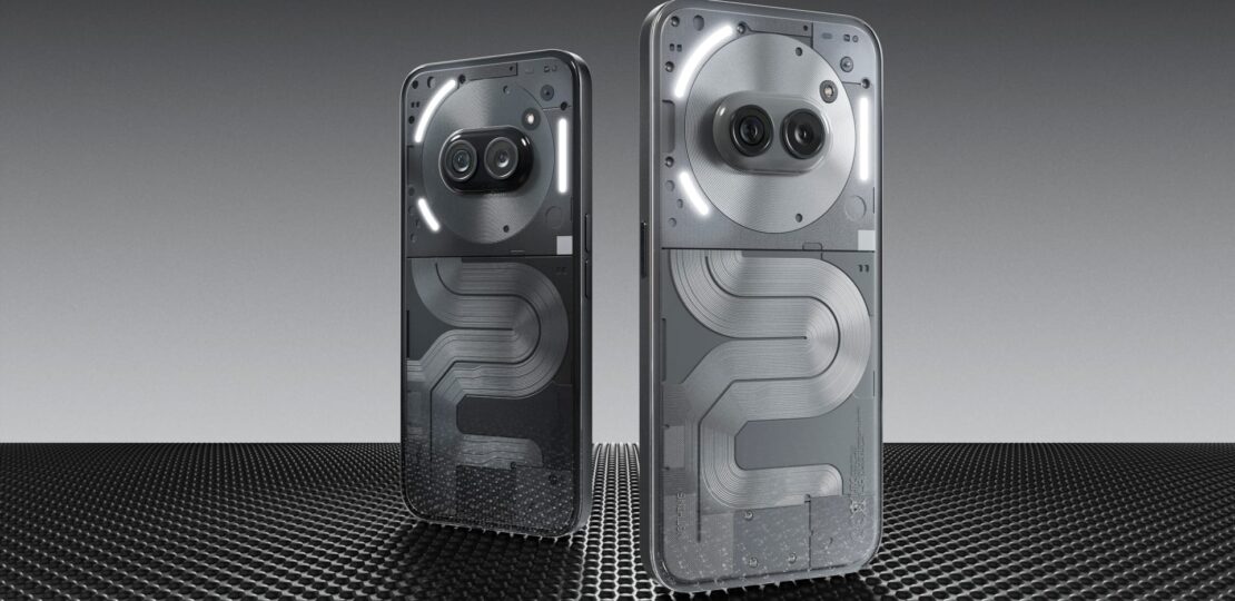
Nothing has been known for its transparent design style, and this phone definitely carries that forward, as well as their earbuds. There’s also a white version, which I personally think looks better, though the dark one has its own cool factor. If the goal was to make a phone that’s instantly recognizable as a Nothing product, then they definitely succeeded.
The dual cameras, placed near the top center, are unique—almost like eyes. The NFC coil surrounds the cameras, and there are three LED bars that form a glyph design around the camera module. The bottom half of the phone features a PCB-inspired look, said to be inspired by the New York City subway map. This design has gotten mixed reactions—some people love it, others aren’t so fond of it. It’s asymmetrical and unconventional, but I think it looks nice. Even if it’s not your thing, at least it’s something different. There are textures, exposed screws, some text, and a little red square that’s purely for aesthetics. I think it’s cool that they added that for no reason other than to look interesting.
This phone is priced in a really competitive range, so while it looks great, you do have to make a few sacrifices. For example, the back is made of clear plastic instead of glass. Zach will probably mention this, but I think the plastic is more likely to scratch and scuff, though it’s also less prone to shattering compared to glass. In my opinion, that’s a decent trade-off. The frame is textured plastic too, designed to look like aluminum, but it’s all plastic around the phone. Because of this, the phone feels surprisingly light in the hand for how big it is. And speaking of size, this phone is huge. It’s a jumbo-sized phone, and while some people might not love the size, a lot of people like big screens, and you get the usual benefits of a larger phone—like a bigger battery and a larger display.
The screen is a 6.7-inch display, which is pretty massive. It’s definitely in the “ultra-phone” category. It also gets pretty bright—though not quite as bright as flagship phones with insane brightness levels these days—it reaches a peak brightness of 1300 nits, which is more than enough for most indoor settings. The bezels are thin around the whole front of the phone, and visually, it looks great. For the price, the display is AMOLED, with an optical fingerprint reader under the glass, a variable refresh rate of up to 120Hz, and 2160 Hz PWM dimming. If the back of the phone doesn’t impress you, the front screen should, especially for just $350.
But honestly, the battery life is one of the phone’s biggest strengths. Battery performance comes down to three things: a big battery, efficient software, and a power-efficient chip. We’ll get into the software in a bit, but this phone has a 5000mAh battery, which is actually larger than the batteries in some of Nothing’s flagship models. While it doesn’t support wireless charging, it does offer 45-watt wired charging, meaning it can charge from 0 to 100% in just about an hour. It’s powered by the MediaTek Dimensity 7200 Pro chip, which handles things pretty well.
Going into testing this phone, I had one big question: how well would it actually perform? Nothing tends to tease their specs ahead of time, but when I found out it had a MediaTek chip, I wasn’t sure it would stack up to some of the other phones I’ve used. Of course, they show off benchmark results, but they only compare it to the two-year-old Nothing Phone 1, which had the mid-range Qualcomm 778G Plus chip. I wasn’t expecting flagship-level performance at a $350 price point, but I still wondered how it would hold up in real use. Honestly, this felt like the make-or-break aspect of the phone. And I’ve been pleasantly surprised.
It’s not going to win any awards for raw specs, and the benchmark numbers definitely don’t impress, but the real-world performance is actually pretty solid. The way I’d describe it is “respectable,” and I think that’s a big credit to how well the software and hardware work together.
We’re currently on Nothing OS 2.5, built on Android 14. If you’ve used Nothing’s software before, you’ll recognize the clean, dot-based aesthetic. It’s simple, with no bloatware, and there’s a real focus on speed and smoothness. Honestly, it feels like a throwback to the old OnePlus days, where the software was fast and fluid. In normal, day-to-day use—messaging, browsing, checking email, taking pictures—it’s snappy and smooth. The fingerprint reader can be a little finicky at times, especially when unlocking it, but otherwise, it’s a solid experience. It’s very similar to the Nothing Phone 1 with its 778G chipset in terms of everyday performance. But once you start pushing it with more demanding tasks, like gaming, you can see where the benchmarks fall short—frame drops and lag can start to happen. But for $350? I’m definitely not complaining.
Nothing has had some time to refine its style and identity, and it’s clear they’ve figured out what they want the Nothing phone to be. The result is a phone with some pretty distinctive, recognizable features that you’ll either love or hate, but they’re definitely memorable.
Aesthetically, the phone sticks with the “dots” theme. The stock apps all follow this design, using a thin, clean font to match. Even the Android back arrow is made up of dots. They’ve also added a nice selection of widgets, most of which carry this dotted look, so you can create a very consistent and cohesive home screen. There are some smaller details, like the ability to make an app icon larger to cover four spaces on your home screen, allowing for a unique grid layout. It’s a fun little customization, if you’re into that. The folders on the home screen have a subtle animation too. Another nice touch is a new feature that adds a glass-like effect to your wallpaper, blurring the background to improve visibility behind your home screen icons. I think it’s a nice, practical feature.

There are also AI-generated wallpapers now, so you can create some abstract, quick designs with just a few taps. For customization lovers, there’s third-party icon pack support too, with instant previews, making it easier to change things up.
And of course, we can’t forget about the glyphs. While the lights on the back aren’t as flashy as the Phone 2, they still offer a decent amount of functionality. You get a vertical light on the right side, a smaller one at the bottom left, and a larger one that arcs around the top left. This top light works with the glyph countdown timer, which is a nice touch. The notification glyph blinks when the phone is face down, which is helpful. I still wish I could customize this more—if they added RGB lighting, I’d love to assign different colors to different app notifications. But for now, it’s just white, which still works. The glyphs also act as music visualizers, syncing with whatever’s playing from the speakers.
Some of these features might feel like gimmicks, while others could be useful every once in a while. For example, I don’t usually use the countdown clock, but the one time I did, it was actually pretty cool. As for the glyph composer, I couldn’t get it to work on this phone. The UI worked fine, but the lights on the back never lit up. The glyph fill flash can be handy for close-up shots sometimes, though it’s not always that useful.
Now, about the camera. The cameras on the back are fine—nothing amazing, but totally practical. When it comes to budget phones, we kind of expect the cameras to be average. You know they’re not going to blow your mind, but you still test them to see what they can do. This phone has a new 50-megapixel main camera, plus the same ultra-wide and selfie cameras from the Nothing Phone 2. The pictures are decent—not incredible, but passable.
Even though it’s a 50-megapixel camera, I’ve gotta be honest: even in good lighting, the photos don’t feel all that sharp. The dynamic range and depth of field are pretty basic. You’re not buying this phone for the best photos or videos, but for day-to-day stuff like quick shots, scanning documents, video calls, and sharing pictures, it works just fine. It gets the job done without any issues.
What really stands out, though, is how many features from the more expensive Nothing phones have made it into this budget version. The only big one missing is macro mode. But overall, it feels like they’re not cutting too many corners. It actually seems like they’re giving you most of the Nothing phone experience for a lower price.
While the Nothing Phone 2A isn’t a perfect replica of higher-end models, you can definitely feel the trade-offs, particularly with the hardware. There’s no wireless charging, it has an IP54 rating instead of IP68, and it’s made of plastic rather than glass and aluminum. But when you start using the phone, especially with the software, it doesn’t feel as cut down as some other budget devices. For example, unlike many budget phones, it doesn’t lack features like pro camera mode. All the advanced settings, experimental features, and Nothing OS home screen features are all here, making the experience feel much more premium.

What’s interesting is how far they’ve come since the Phone 1. At first, it’s easy to ignore comparisons to the older model, but once you take a closer look, it’s clear how much better this phone is. The Phone 2A has a larger, brighter screen with thinner bezels, a bigger battery with faster charging, a faster processor, a better front camera, and more refresh rate options than the Phone 1. No wonder they keep bringing up the older model.
Overall, if you’re looking for a solid budget phone, the Nothing Phone 2A is a great choice. With Nothing promising three years of Android updates, this phone should hold up well for a few years. Well done, Nothing!
RELATED POSTS
View all
Apple’s iPad Pro M4: A Stunning Device with Some Questionable Moves
December 9, 2024 | by ranazsohail@gmail.com

Samsung Galaxy S25 Series: S25, S25+, and S25 Ultra
January 22, 2025 | by ranazsohail@gmail.com